Nothing brightens up your world like a fresh lick of paint on your walls. Choosing the right paint brand is the first big step, and saying ‘you’re it’ to that one true blue wall paint colour that makes your heart sing? It’s a veritable triumph. Most of the time.
If you’re anything like us, once or twice you’ve wavered on your paint sample choices, and it was off to the DIY store to look at paint swatches. Again.
But, what if you’re an interior designer? Making the absolute right call about what paint brand (and colours) to specify each and every time makes those décor stakes so much higher.
Corner any interior designer and they’ll confess to having a tried and trusted paint brand with a top-notch wall colour pick up their sleeve. It’s their ‘cheat paint’ for when there’s zero margin for error in specifying a wall colour that not only looks spectacular but is robust to boot.
We’ve asked nine top interior designers to lift the lid on their most trusted wall paint brand plus the amazing paint colour from that brand they can’t get enough of. You’ll see a few brands mentioned a couple of times and we just thought we’d let you know the designers had free rein to pick the paint brands they love.
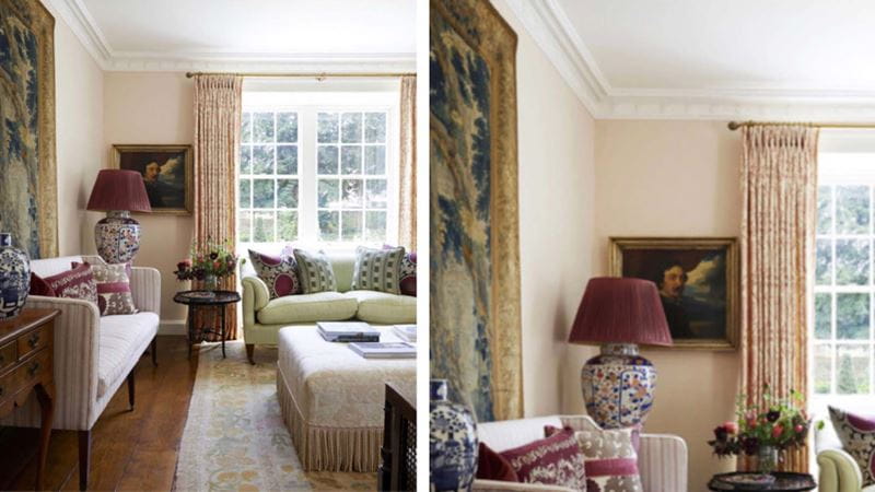
Edward Bulmer Natural Paint – Jonquil
Rose of Jericho – Venetian White
“I actually have two favourite paint brands. The first is Edward Bulmer. They are my go-to for their natural and nasty-free ingredients and the ability to vary the paints’ strength. My favourite colour from them is the perfectly pink, just peachy enough Jonquil.
“My other favourite paint brand is Rose of Jericho, which is based in Dorset. They deal in completely natural chalk-based paint made with natural pigments. I adore using them for that really traditional specialist finish.
“Nothing beats the movement and depth it creates. We even ship these paints especially to be used in our America-based projects.
"My favourite colour to use over here in the UK is Venetian White. It has just a hint of pink which works so well in old houses combined with antiques and fine art.”


Farrow & Ball – Cook’s Blue
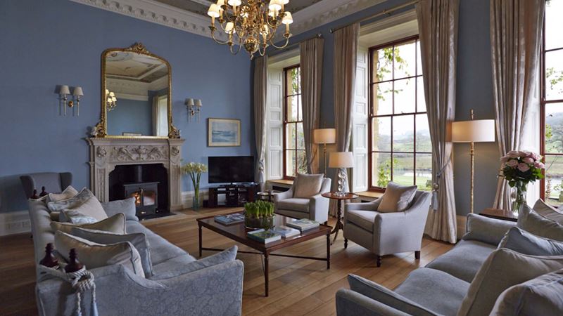
“Historic homes love a burst of strong colour. During the Regency period in particular sky blue and pea green were among the most popular,” Lake explains.
“Cook’s Blue by Farrow & Ball is a wonderful shade to recreate a classic look that is soft and relaxing yet still boasts personality and confidence. We recommend pairing this cooler blue tone with brass accent details to provide warmth and luxury to any room.”
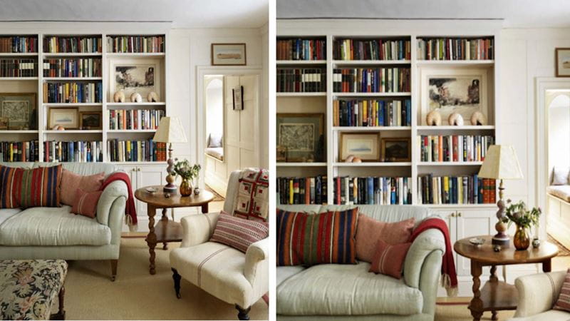
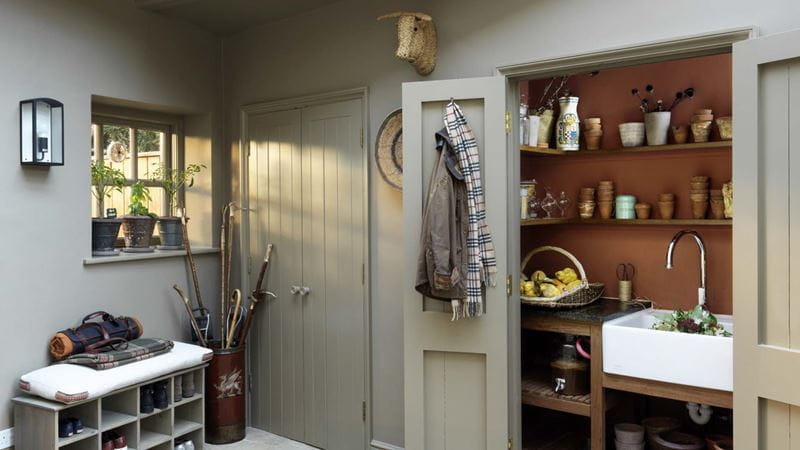
Edward Bulmer Natural Paint – Red Ochre
“Paint which protects the planet must be the way forward in our industry. Edward Bulmer, the founder of Edward Bulmer Natural Paint, is the pioneer of this, working to the highest standards of ethical trading and a low carbon footprint,” says Glaister.
“They work with natural pigments to create their beautiful historic colours which are so important to our health, our homes and our planet. They are as beautiful inside as they are out.
“Here we used Red Ochre in the boot room of a Grade II listed rectory in Oxfordshire. We love the deep earthy tones especially when contrasted with neutral tones.”

Farrow & Ball – Sudbury Yellow
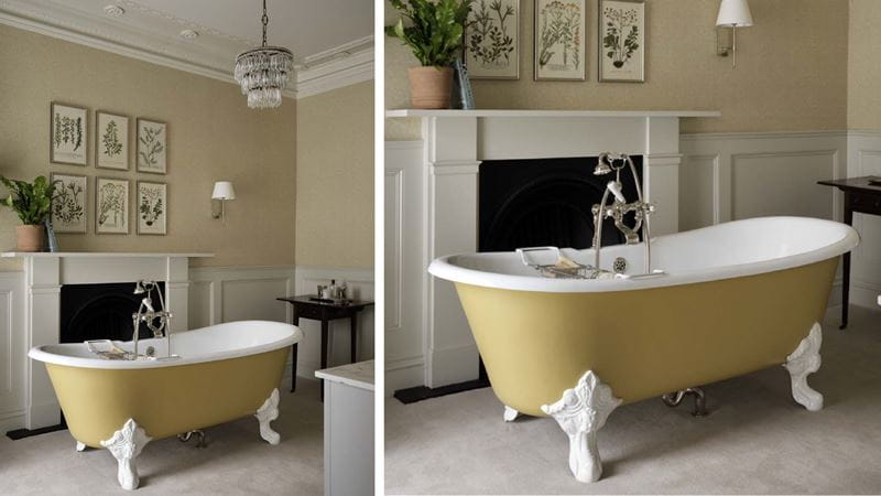
“Farrow & Ball paints lend themselves well to both contemporary and more traditional interiors, making them a versatile choice for an interior designer,” Wicksteed told us.
“Using a cheerful yet natural shade like Sudbury Yellow to paint the bathtub in an historic English country estate brings moments of freshness to the design, without jarring with the property’s original features and aesthetic.”

Paper & Paint Library – Blue Blood
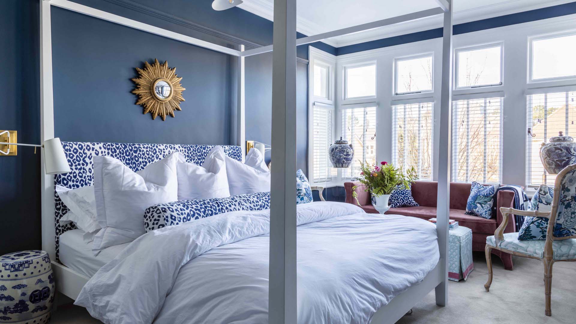
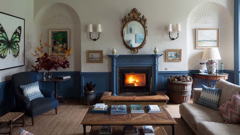
“I like Paper & Paint Library Blue Blood. It is a strong earthy blue that works well on panelling, joinery and internal woodwork. It has quite a brave vibrancy to it and is definitely a blue rather than a grey blue – it makes a strong statement but works well in both traditional and contemporary spaces.
“It can be paired with an off white without too much yellow, such as the Stone range also from Paper & Paint Library, or with a green/grey.
“Seen here in a castle in Ireland, it updated the original Georgian panelling and plaster work to create a younger, more friendly atmosphere to the family television room.”

Edward Bulmer Natural Paint – Lilac Pink
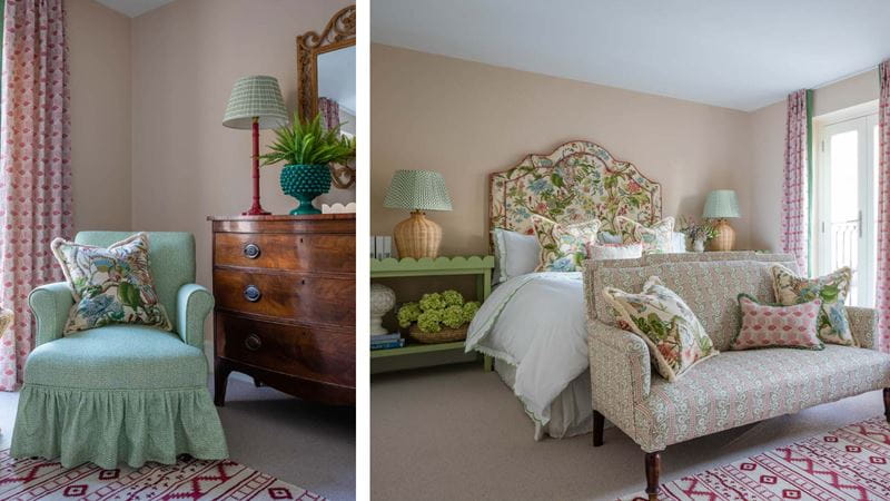
“We had the joy of recently discovering our favourite new neutral. Lilac Pink by Edward Bulmer is a barely-there pink which is the perfect backdrop for our layered interiors.
“In some lights, it’s more of a parchment tone and in others, it is a soft blush. We are finding ourselves using this colour in bedrooms as it is warm and soothing. Similarly, we are using Lilac Pink in sitting rooms and entry halls where it looks equally as fabulous!”

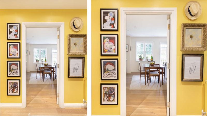
Farrow & Ball – Citron No. 74
“When selecting colours for a space, I always strive to ensure that they reflect the desired atmosphere. For example, in a small hallway, I wanted to create a playful and lively ambiance, and I found that yellow was the perfect choice.
“As my favourite colour, Citron No. 74 from Farrow & Ball brings warmth and energy to the area, and it always puts a smile on my face as I enter.
“Some may find it unexpected, but I have found that artwork looks great against a yellow background, making a smaller space appear larger.”

Edward Bulmer Natural Paint – Celadon
“With so many varieties out there, it is impossible to pick a favourite, but at the moment I particularly like Celadon by Edward Bulmer.
“It’s a softly spoken, harmonious blend of green and blue that works equally well as a pastel contrast to creamy whites or as a muted backdrop to more vibrant colours.”

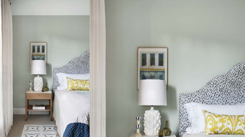
Farrow & Ball – Light Blue
“Light Blue from Farrow & Ball is a gentle and peaceful pale blue that has just the right amount of grey in it meaning it never becomes cold or icy, perfect for large country house bedrooms.
“It looks lovely with a neutral colour palette, but we like to use as a calming backdrop for rooms full of pattern, colourful textiles and colours such as yellows, pinks and greens.”

Want to explore even more gorgeous painted interiors imagery? Check the beautifully curated inspiration and advice pages for Farrow & Ball, Edward Bulmer Natural Paints, and Paper & Paint Library.

The best advice on preparing and painting your ceiling from a professional.
