Image credit: Sean Symington Interior Design
Dreaming of a good night's sleep? The right bedroom colour can make a world of difference. We all know the frustration of tossing and turning in a room that feels anything but tranquil.
Creating a restful bedroom isn't just an aesthetic need either. Getting enough sleep is proven to play an important role in the quality of our lives. Research carried out by University College London found that getting less than five hours of sleep a night in mid-to-late life could be linked to an increased risk of developing at least two chronic diseases.
To help you unlock the power of colour for a truly restful night's sleep, we've gathered insights from top interior designers and colour experts – all that's left for you to do is choose your favourite shade.
Ever wonder why a room filled with sunshine makes you feel energised, or why a calming blue can lull you to sleep? That's colour psychology in action.
It's the idea that simply surrounding yourself with certain colours can influence your mood and behaviour. Imagine swapping your morning coffee for an orange painted room – that's the basic exposure principle.
Colour theory stretches back to the ancient Egyptians, who used pigments for everything from decoration to medicine. Today, therapists might use coloured lights to create specific moods during sessions. Marketers and designers also strategically pick colours to influence how we feel about their products or spaces.
For anyone harbouring doubts about just how powerful, and predictable, our reaction to colour is, it’s worth knowing that, according to a study by Emerald Insight, up to 90% of snap judgments made when buying products can be based on colour alone.
Paint makers and interior designers know that colour is a powerful tool. For example, a bedroom design with white walls can be a cruel joke for a migraine sufferer. Likewise, if you want to know how to decorate with red at home, avoid the bedroom - it’s likely to speed up the pulse and heart rate, the complete opposite of what you want when you are craving those 40 winks.
With that in mind, here are the top four bedroom colours for sleep...
Best for: stimulating sleep hormones

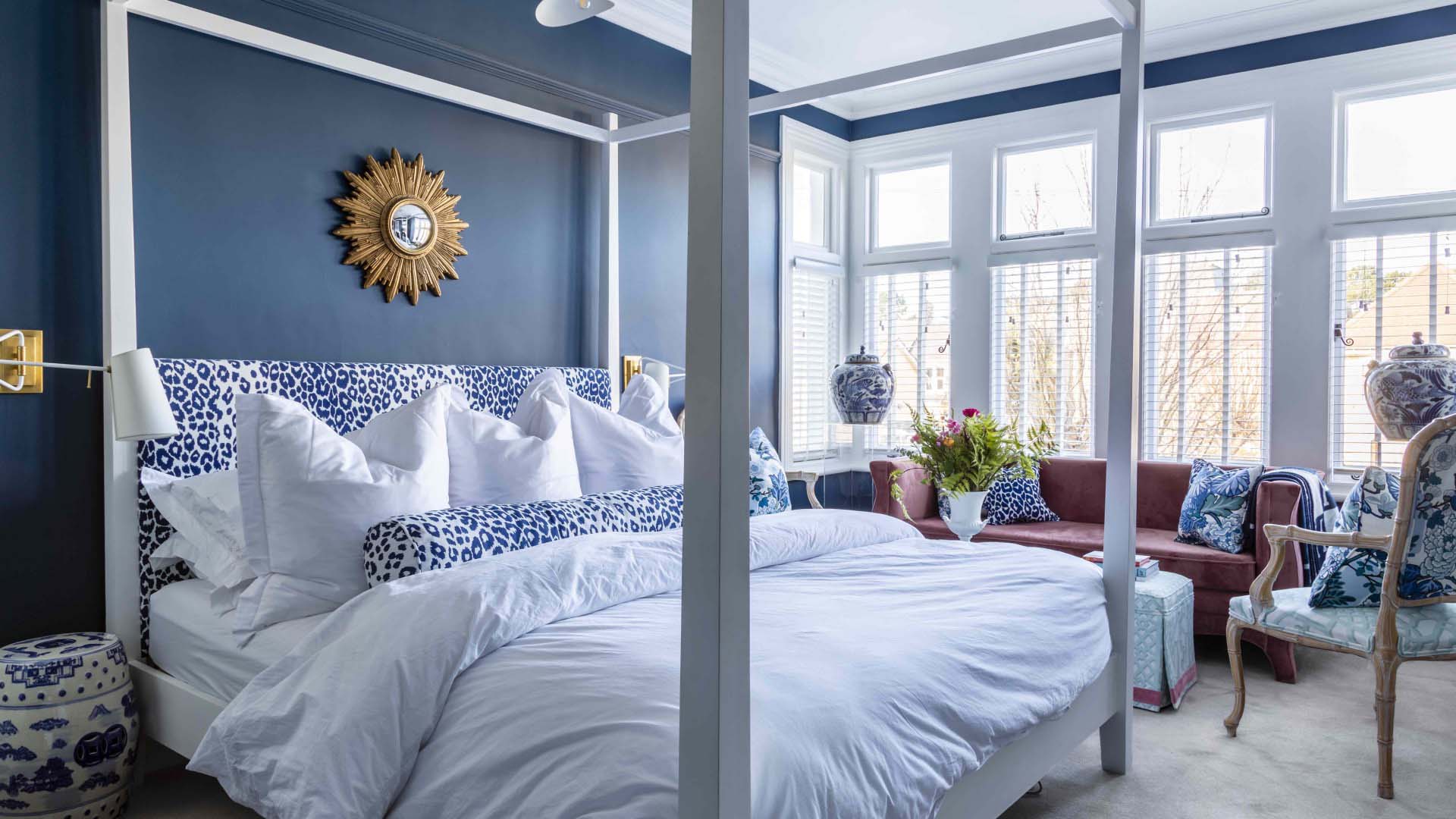
When it comes to the best bedroom colours for sleep, blue comes out on top every time. Blue is the king of the snooze colours because we have special cells in our eyes called ‘ganglion cells’ that perceive blue better than any other colour. When these cells encounter blue, they produce melatonin, the sleep hormone.
This fact hasn’t gone unnoticed by hotel chains. In fact, Travelodge carried out research to find out what colour room helped guests to enjoy the longest sessions of unbroken sleep. Blue topped the list, with the typical guest enjoying 7.53 straight hours of sleep when walls were coated in blue paint.
Paint expert Annie Sloan agrees. "Rather than opting for light blues associated with free sky thinking, use a deep blue to encourage restful introspection," she says.
Choosing a rich, strong blue – think jewel toned emeralds with a lot of warm green pigment in the mix, or inky navy blues – will take a lot of “noise” out of your space and give a cosy, secure feeling.
Best for: the soothing connection to nature
Green's colour psychology is a little complicated. Meanings for the colour can vary wildly depending on context, from envy to fertility; war-wear to the green shoots of spring.
If the shade is chosen with care though, your bedroom design can benefit strongly from the most potent association which green offers – the stress-reducing tranquillity of peaceful outdoor spaces. In fact one study by gardening therapy charity Thrive showed that being surrounded by natural greenery and the colour green the can lower rates of anxiety and depression.
Best for: being both restful and stimulating
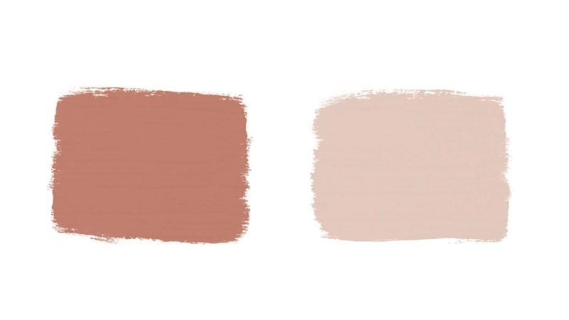
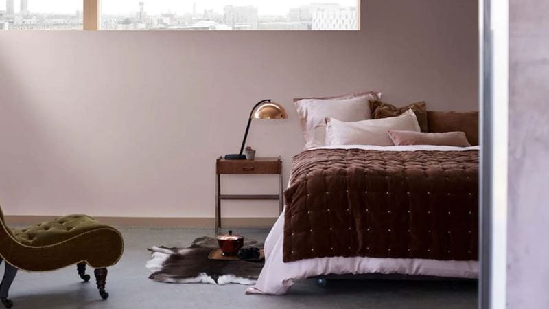
Once upon a time, pink walls were limited to girls’ bedrooms. Today, it is amongst one of the most popular bedroom colours for sophisticated and restful adult bedrooms – this is particularly true for dusky and pastel pinks, which are extra soothing and calm. As well as evoking feelings of comfort and warmth, pink is also a sign of good health.
Pink tends to be associated with all things gentle, feminine and kind – thus its highly restful qualities. But that isn’t to say pink doesn't have a wild side – hot pink can be a bold, 'in your face' colour choice. Its impact can be highly stimulating – which is perfect for a room scheme that you want to be both calming at night and energising in the morning.
Apply liberally: “When using pastels, you should layer a stronger version of the same colour to bring out the depth of colour in the pastel,” advises Sloan.
Add green for a punchy final look: as with all pastels, a muted pink can become more of a challenge for eyes to pick up on from age 40 plus. To create maximum contrast with pink, try pairing with select punches of green for a restful yet visually stimulating scheme.
Balance masculine and feminine: pink isn’t just for women. To balance out the more feminine qualities of pink, Dulux recommends complementing pink with accents of warm neutrals or black and some copper lighting.
Best for: a peaceful mood and mind
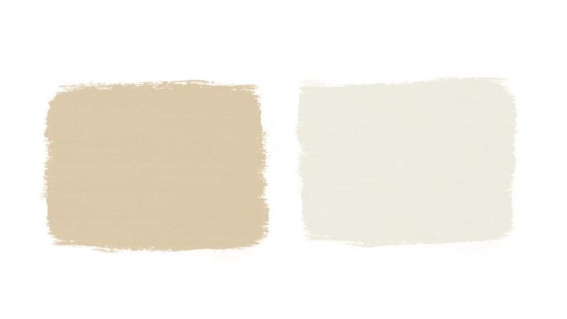
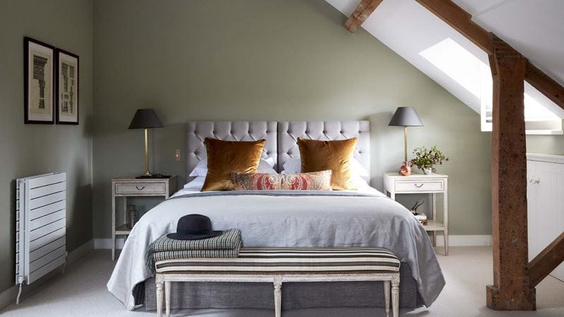
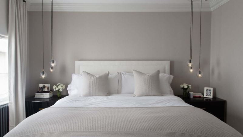
For a bedroom that is silent, but not stark, colour psychology suggests you should be cosy-ing up to the neutral family. For creating a restful sleep sanctuary, they quietly earn their place amongst the best bedroom colours. Neutral colours are very light shades of colours like beige, taupe, cream, grey and black.
They have a hint of earthiness that makes them feel naturally peaceful and their subtle underlying colours can be shown up in changing lights. Best of all, unlike stark white paint, off-white neutrals are a bit easier on the eye, but still give minimalist serenity.
With all of that washed out mellow earthiness in your bedroom, you would be forgiven for thinking that neutrals are wonderful for soothing sleep but boring for waking hours.
While that can be true, neutral bedrooms with the right materials mix are highly photogenic. The secret is to think layers, textures and a rich interplay of surfaces finishes like glass next to wood.
Lucy Scott, paint specialist at Edward Bulmer Natural Paint suggests a good way to begin is to purchase a non-toxic, breathable natural paint, which contain no harmful VOCs, for a bedroom that looks good and is better for you, too.
"Make sure you check the ingredients on the tin and ensure they do not contain acrylics or toxic chemicals that could cause health issues and breathing problems which in turn affects a good night’s sleep!" she says.
"The beauty of our paint is because it is made with our ground-breaking plant-based binder and natural earth and mineral pigments, you can sleep in it the same day as decorating."